
This project is a prototype for a tactile map that helps teach visually impaired people about world mythology.The map is a map of the world that has embossed numbers, and a corresponding key with a number, icon, and QR code. For the future, I would also like to include 3D models that a user can feel. In their place, I used figures that I had of a few mythological creatures.
I also conducted research on some of the standards for tactile maps. The main concepts that I took from this research were the use of Sans Serif fonts, the necessity of reducing clutter, and the need for simplicity.
I used a few different sources for selecting mythological creatures. The two primary ones were A Book of Creatures, and The Atlas of Monsters. Both of these included details about the creatures, images, and geographic location.
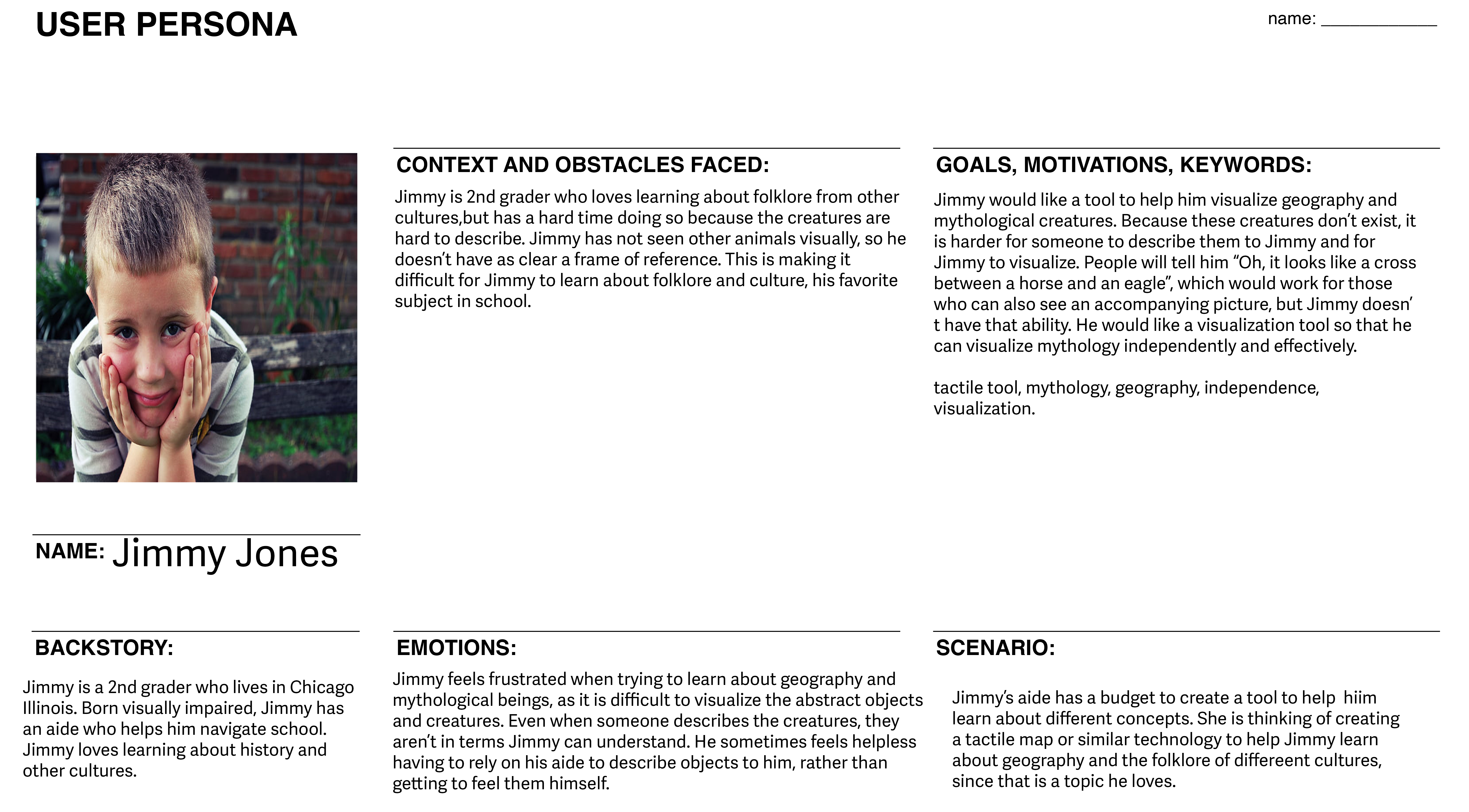
To help guide my process, I created a user persona, Jimmy. Jimmy is a visually impaired 2nd grader, who loves learning about folklore and other cultures I made my persona a child as I figured mythology is a topic that children might have trouble understanding, and I wanted my map to be educational. Since I am not vision impaired myself, it was important to keep in mind what a vision impaired person would need in a tactile map.


.png)
I planned out several variations of my map using a digital whiteboard. Many of the changes I made were done for spacing. I was taking into account how well the letters would fit onto the map, and how easily someone who is touching the letters could differentiate them.
I next created my designs in CAD so they could be 3D printed.

One of my original designs for the tactile map. I decided not to use this version due to scalability.

A prototype I created to scale down the world map into printable sections.


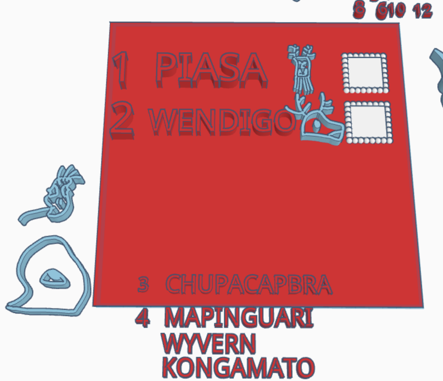

One version I had designed for the key had numbers, name, icon, and a spot for a QR code. I found that the letters took up too much space, so I decided to omit it and place it in the audio description from the QR code.

One design I created where the key would have been above the map. I found that this didn’t give the key enough spacing for each creature. I also did a test print from the map, and after some peer feedback found that it would be easier to differentiate the numbers and the map if they were bigger.
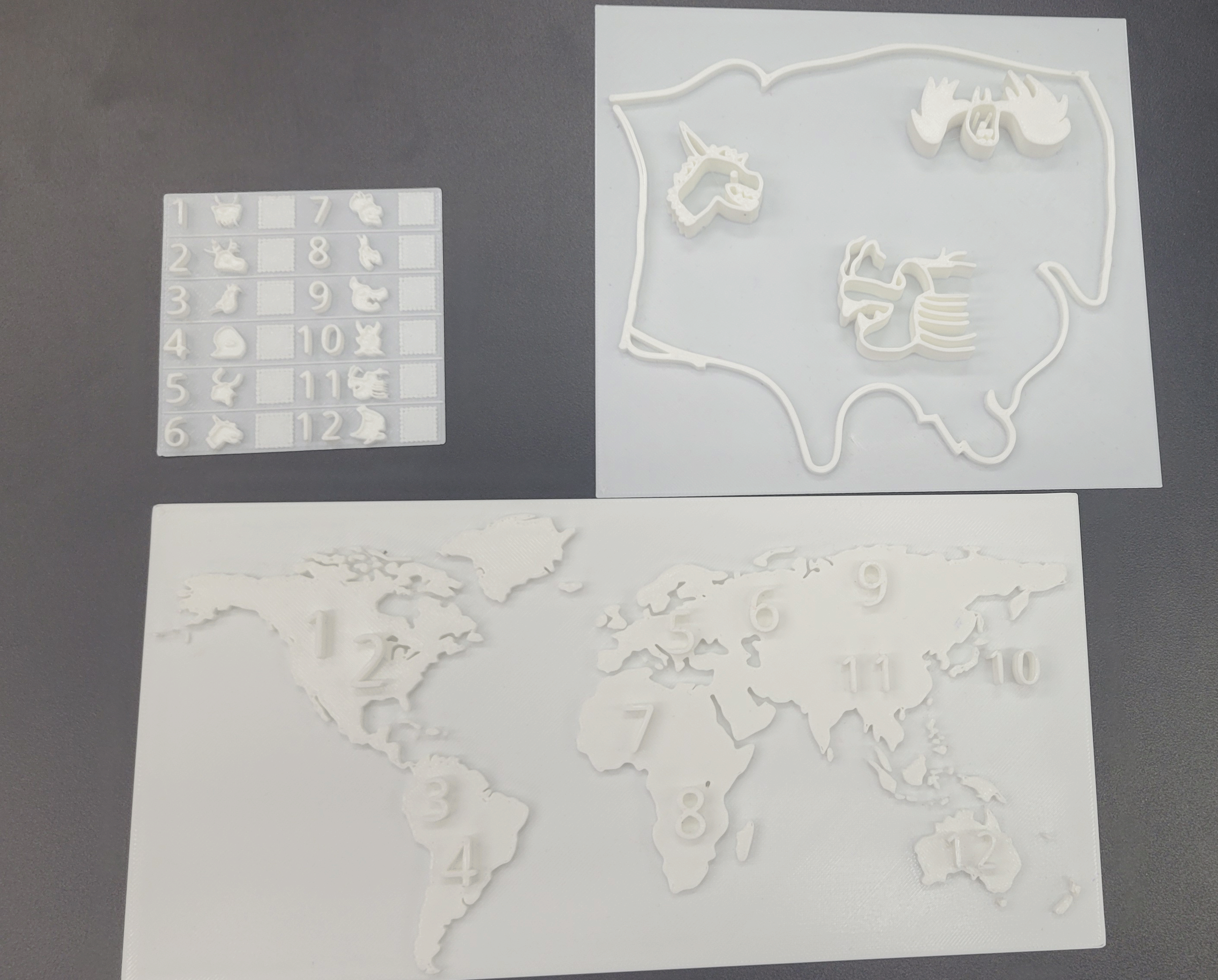
The printed out prototypes for the world map, a section of the world map with creatures on them,and a smaller version of the key.

One change I made to the map following user testing was to add a label saying that this was the world map, since that wasn’t clear without an explanation. Another change I made following user testing was to add an indicator for the orientation of the map. From my testing, I found that users did not know which way to orient the map unless I told them. This was also a suggestion made by one of my testers, who also used the word up to indicate the proper orientation of their map.


