Continuing off of research from last semester on apartment hunting, I went on to develop a prototype for an app that could help solve some of the issues I encountered in my research.
I first created a how might we statement to help frame my problem and purpose of my project:

Using my how might we statement, I created a storyboard to illustrate a scenario where the app might be used. For my storyboard, I focused on the paint points of confusion and lack of trust towards listings in the apartment searching process.


Following the creation of my storyboard, I created task flows for the different features my app could have. I based several of these tasks off of the pain points in my storyboard, primarily contacting a landlord, and reading a landlord review.

I sketched screen designs for 3 of the 5 tasks from my task flows. I focused on contacting a landlord, since that was present in my storyboard. I also focused on compare an apartment and look up the location of an apartment since those helped alleviate pain points found in my user research.

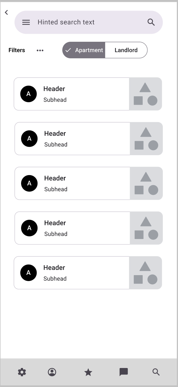
I next created a paper prototype and tested it some users to see how the user flow functioned. I based my prototype on the screen designs I had previously made, but added some extra details. A key change I made from my screen designs was the ability to toggle between searching for a landlord versus searching for an apartment. I made this decision I noticed in the screen design that the search for a landlord and an apartment were nearly identical to each other and wanted to make sure users knew which one there were searching for.
Some important feedback that I got:
- The compare button was not easy to see
- It was not clear what to do on the search page, since there weren't any suggested filters
- It wasn't clear what the compare button did.

I created wireframes of my app. I used an external component library to help create my wireframe. This did make the process faster, but I had to change a lot of the components later on.
One notable change I made from my paper prototype was the inclusion of some example filters, since one of my test users was confused by the search page. I also made the compare button more prominent, since it was not noticed initially in my paper prototype.


I created static mock ups of my app. One aspect of the design that I struggled with was the visual design, as I was creating an app from scratch and had a hard time deciding on what colors to use. I also had some issues with spacing, since my app needed to convey a lot of information, but didn't have a lot of screen real estate.
I made the decision to toggle between the map and search view as the map screen in my wireframes had the map too small, which would not be optimal for a user looking at a map on a mobile device.

I further iterated on my static mock up by implementing interaction. One thing I discovered during the process of creating interactions is that I can utilize some of these interactions, such as scrolling or modals to alleviate my spacing issues.


My final mock up included features to help address the key objectives and user pain points.
Landlord reviews and profiles to help apartment searchers learn more about landlords before they sign a lease.
A comparison feature for apartments to make it easier for users to view price and amenities differences.
Option to view the map along with the apartment so that users know where to find it and don't have to constantly cross reference other sources.
Based on peer feedback, I made a few changes with my final design.